Tuesday, October 21, 2008

Workshop 3: Architectural drawing


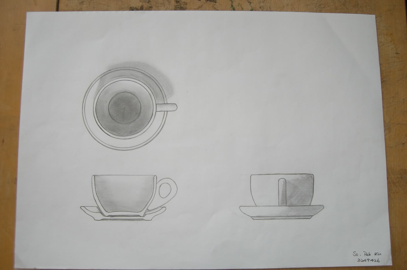
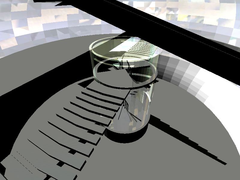
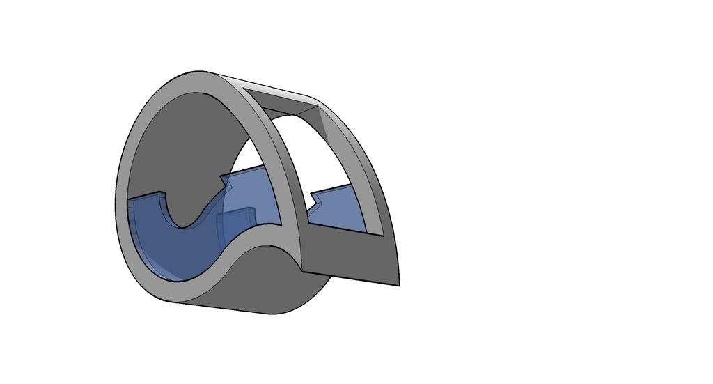
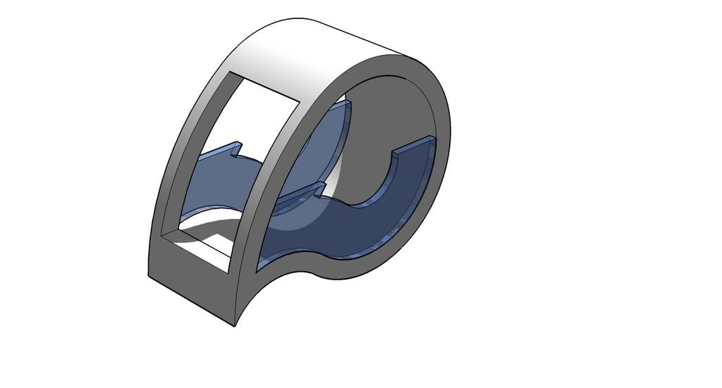
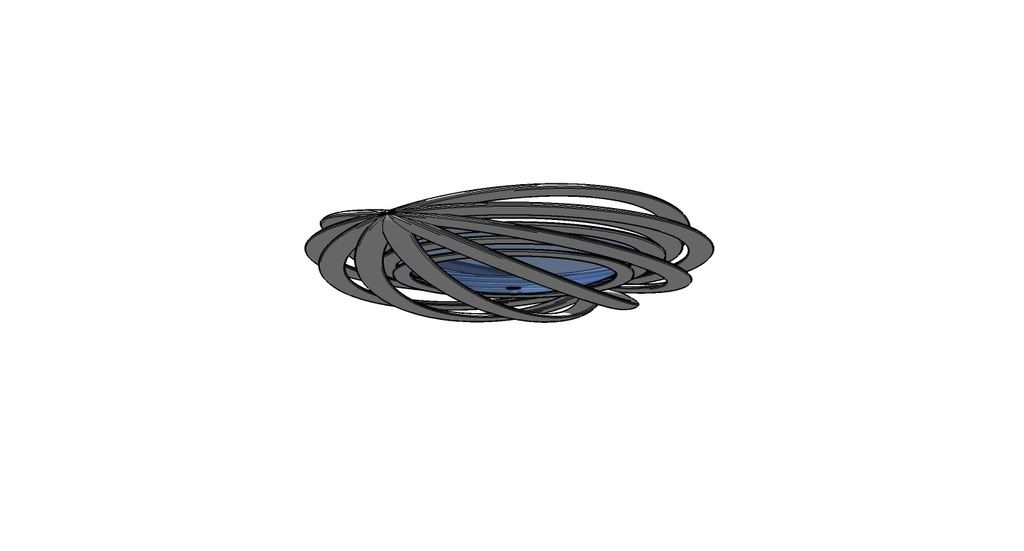
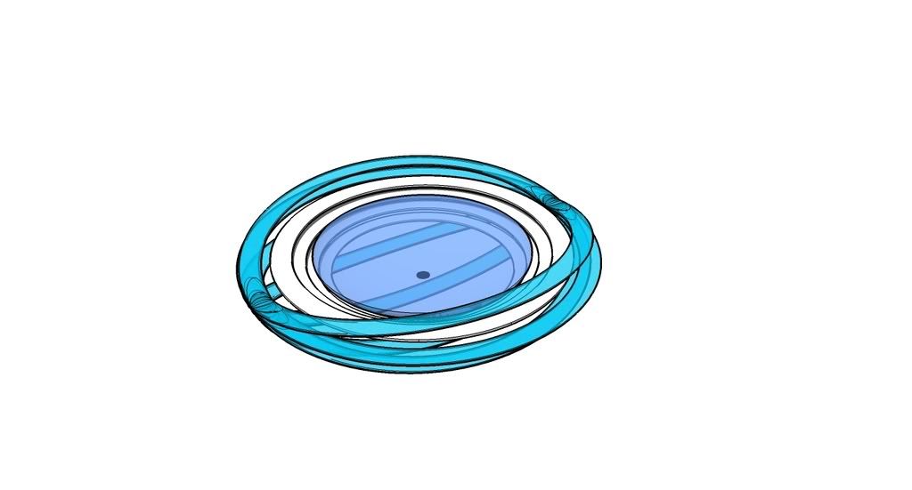
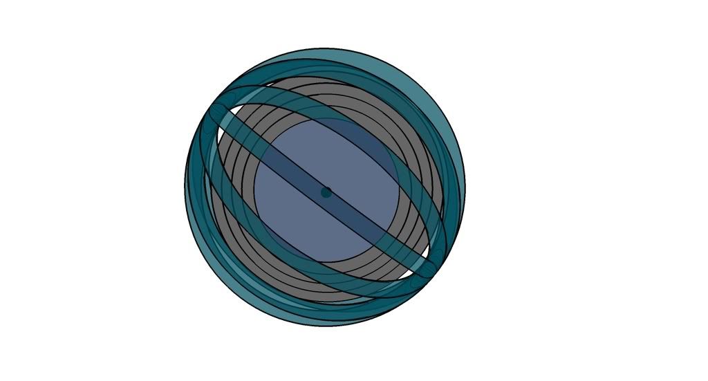
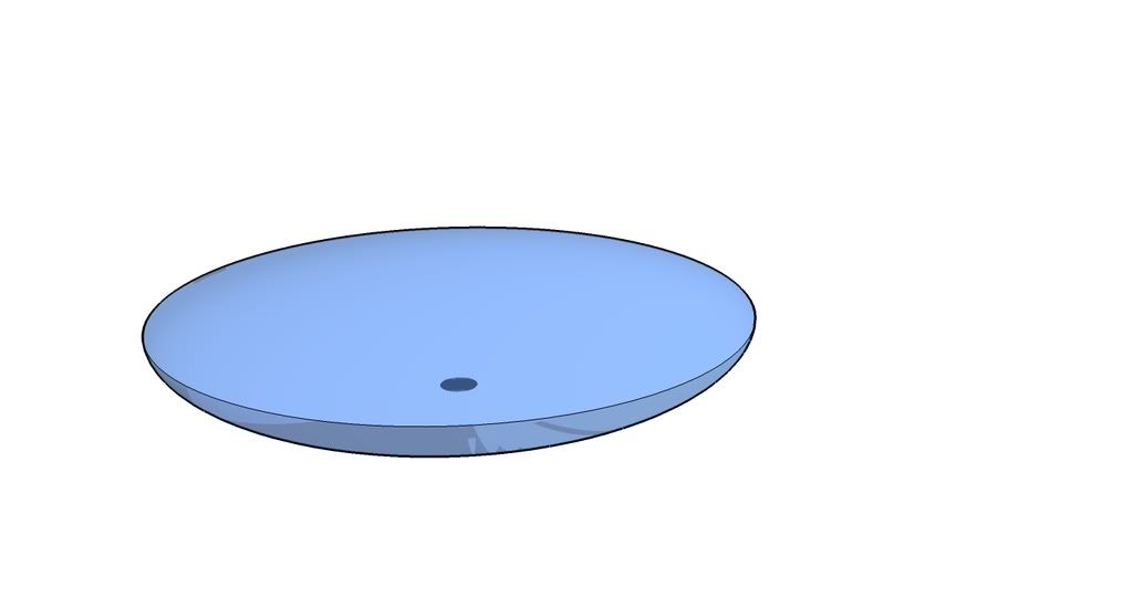
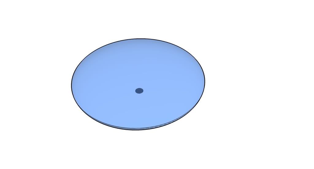
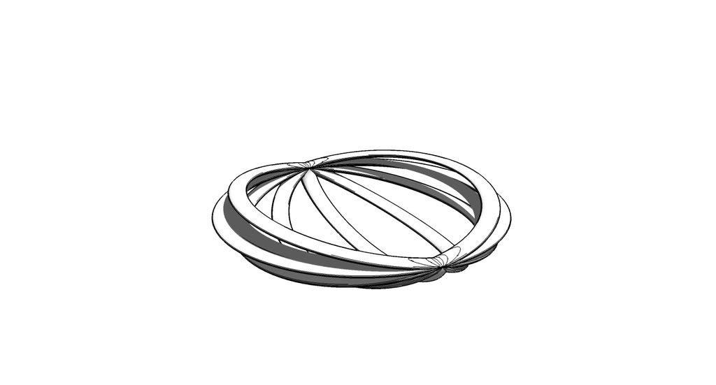
The first class exercise is cup drawing. It's about the plan, section and elevation of the cup. The scale is 1:1. And it's freehand drawing. So, the plan is quite hard to drawing since the circle. For the circle, I draw a cross into a square then draw the 4 slices of the circle. The most interesting part is the rendering. the cup looks more 3D after rendering. This drawing is different with fluid thought. As architecture drawing need the accurate drawings because of the plan and section.


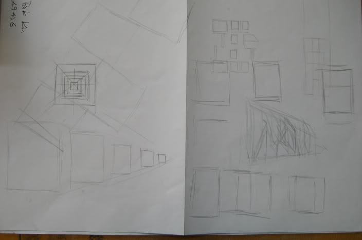
The perspective drawing is very interesting. The grid lines were drawn by tracing. Then drew the Botta house into two points perspective. The important thing of the drawings is make sure the eye level and the scale.


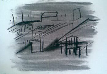
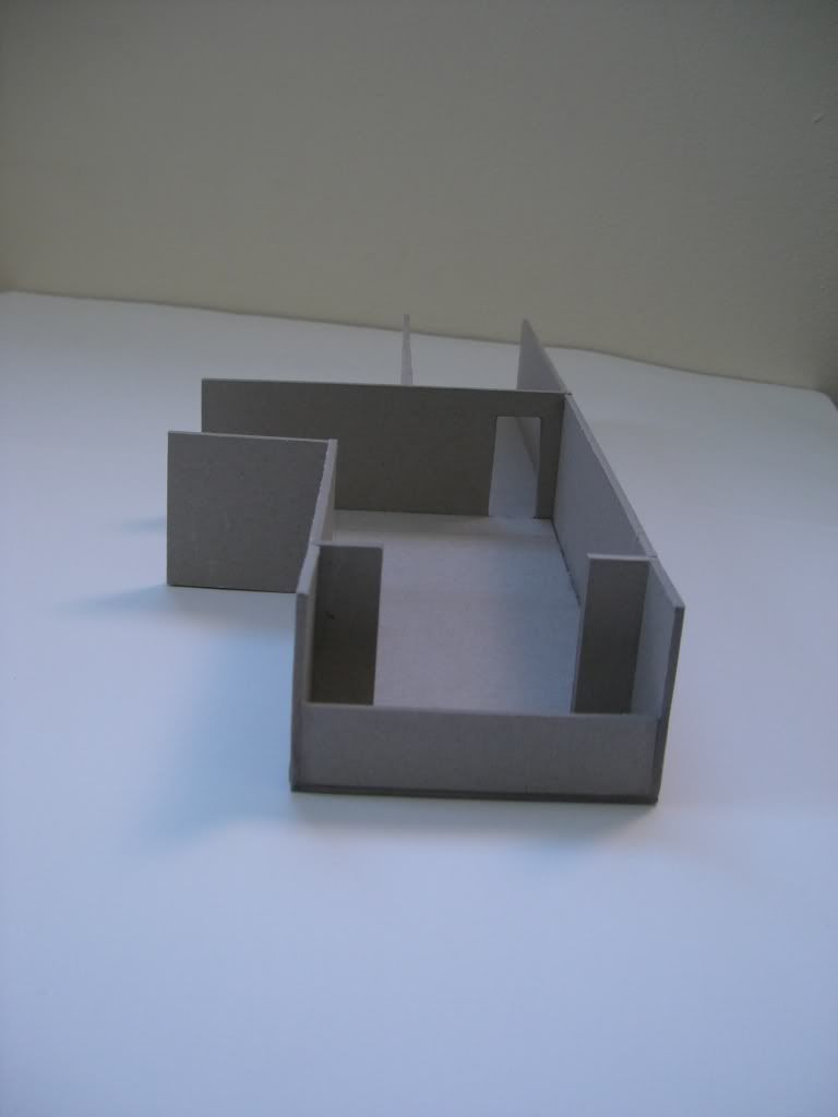
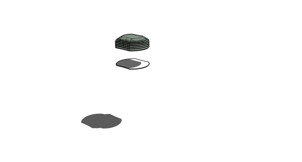
The top one with the sketching is mock up. An A3 paper size was chosen. It's about the final idea and really helping to expand the idea.
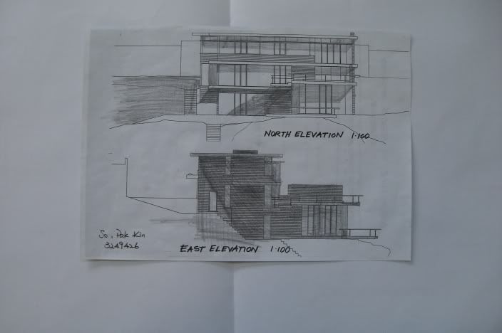
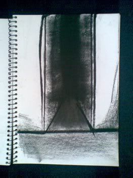
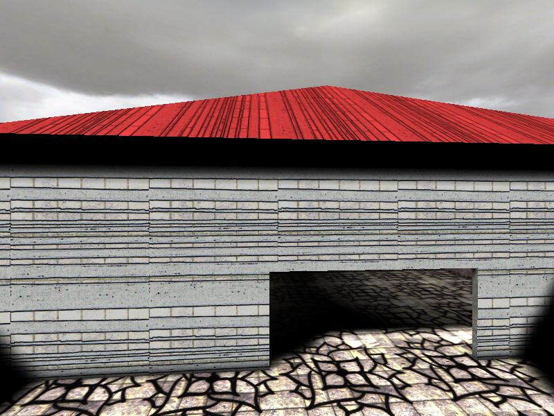
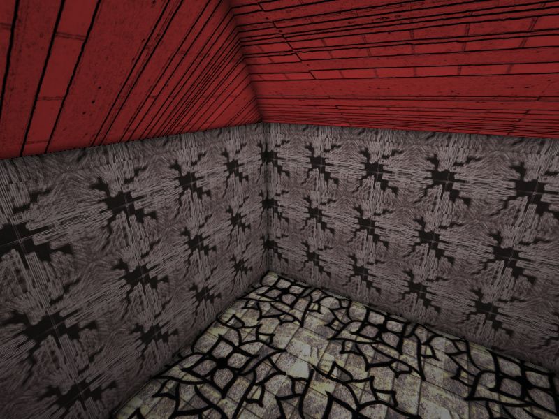
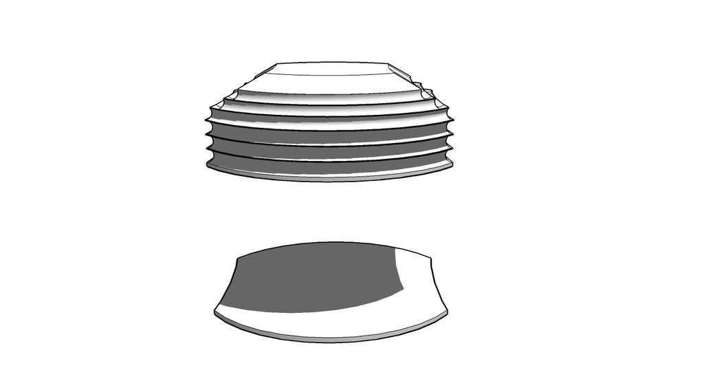
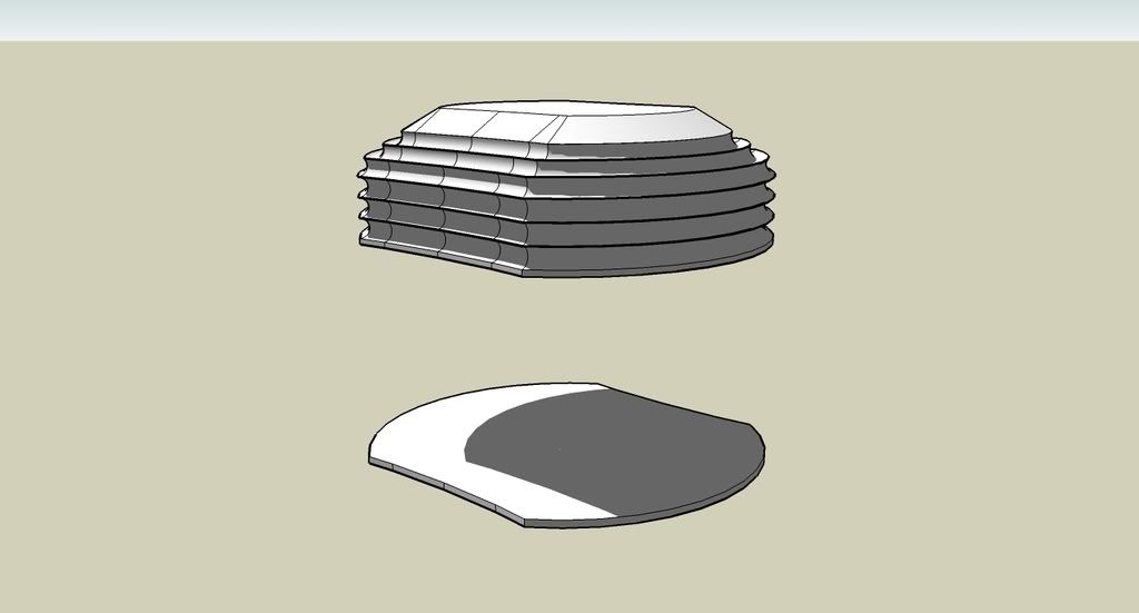
The below one is the shading exercise. Draw all the shadow in elevations. It's quite interesting to learn how to render a building. In this exercise, some parts, the corners are quite hard to render since there are double shadows.


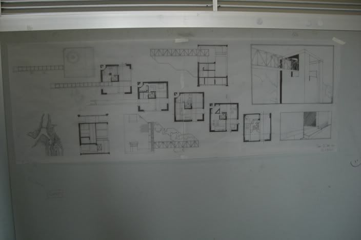
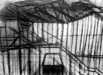
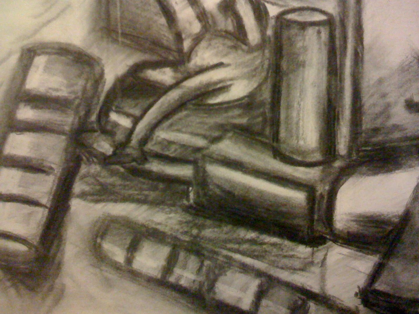
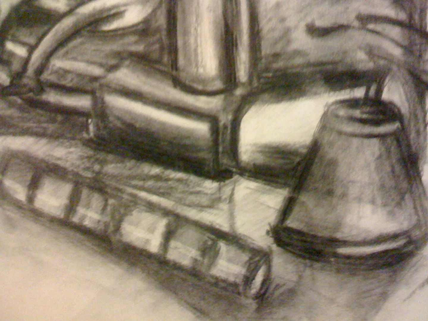
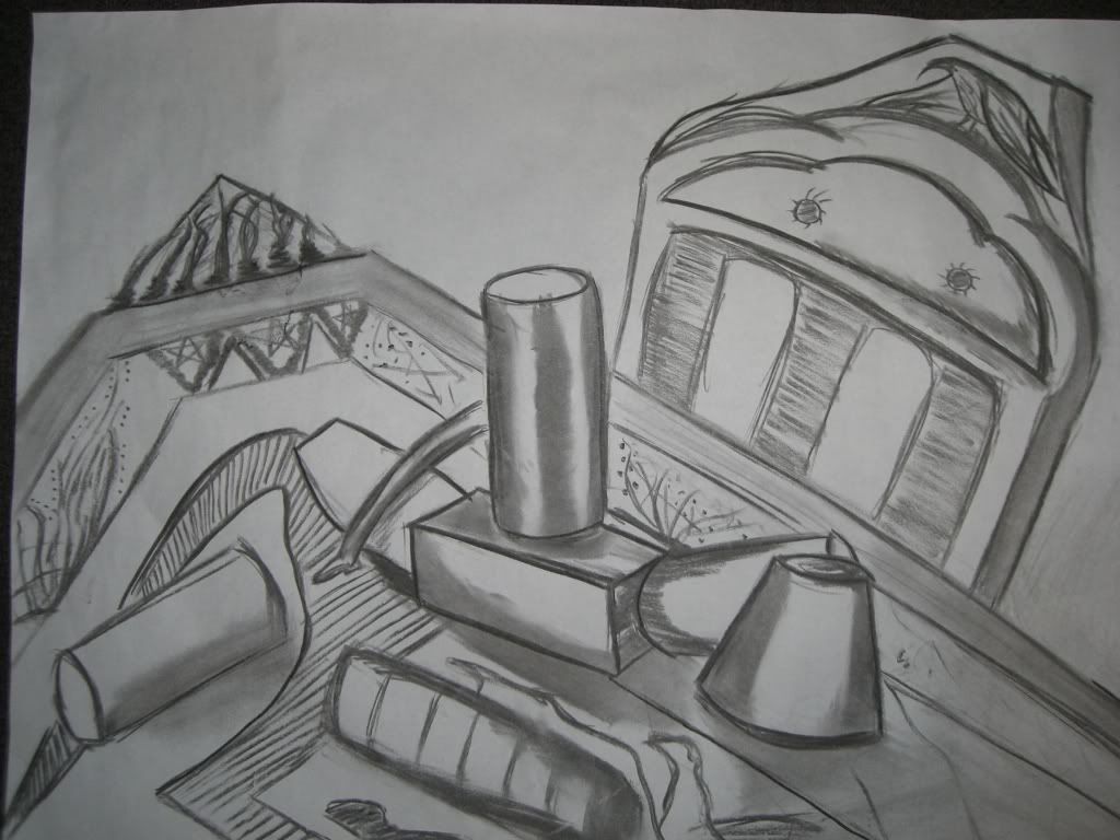
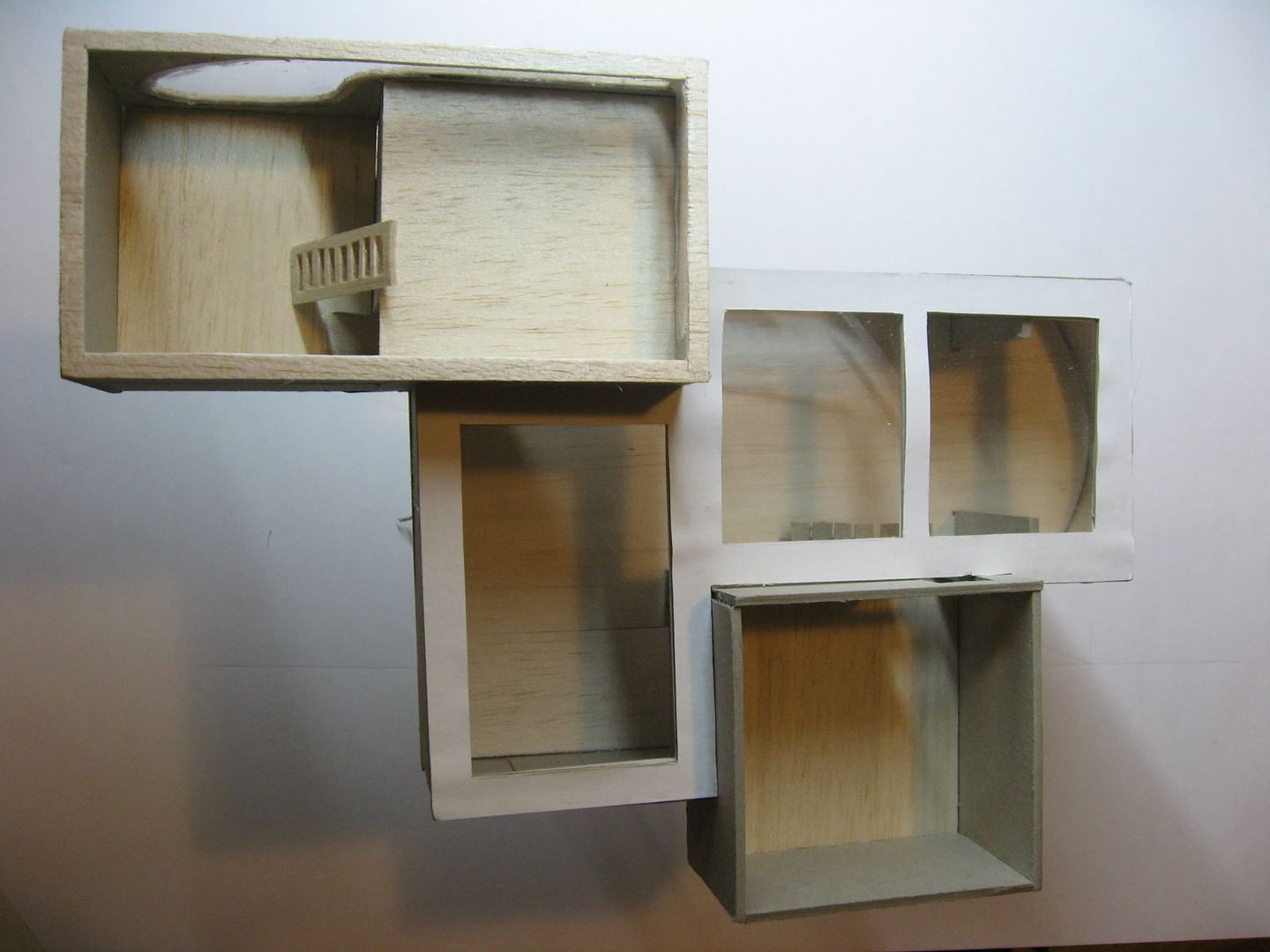
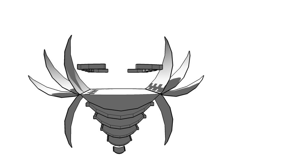
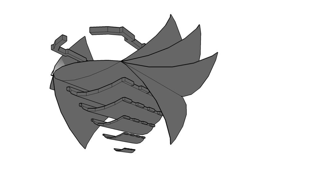
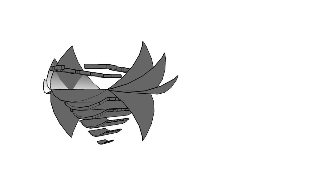
This is the final of drawing. The plans were arranged into slope line and look like a 3d building. The bottom right drawing of door step is representing a connector of those plans. Since people go into the building through the door in bottom right to the top left. And another slop is from bottom left to top right. The relationship of that is changing the size from large to small. For example, site plan --> elevation --> 3d drawing --> door. The relationship of two slop are intersected to form a cross in the drawing.

Workshop 2: Fluid thoughts to actions

Fluid thought is a interesting workshop. And also is a challenge for the drawing since it's the first time i use Charcoal. There was a harbour trip in the first tutorial. Perspective drawings were done in front of Opera house.
This is one of the drawing. It looks a bit messy since the paper was drawn couple times. However, the drawings was done in different position of the same viewing. Therefore, the 3D movement can be found in the drawing. And the old drawings was erased a bit before drawing the new one. This kept the old drawings with new drawings. An action can be brought out when the both drawings existed together.
The drawings skill is very unique and have not even tried before. So it actually is a nice experience to try the kind of drawing.


Those 3 drawings are from the 42 drawings sketching book. This corridor, kitchen in the dark night and handle of stair from top to below. The second one was very impressive. It's because the paper was painted black as the background before the drawing. Through the 42 drawings, some of charcoal drawings skill was learned.


The top 2 drawings are from one of groupmate. Those are in A4 size. And re-draw it into the A2 paper as the same size. Then extend the rest of the a2 space.
This is the final portfolio. 5 or 6 A2 drawings was grouped together and a stand was made for displaying the drawings.

Workshop 1: Materials Modeling

The first workshop is materials modeling. Because i was so interesting about the model making. And there is the chance to improve my skill of making a model.

Through the workshop, i did find many actions and experience to work on a model.
For example, in the 1st tutorial, we were asked to make cube and a model of a object.
The tutors didn't taught us anything before making cube. However, they explained how to plan the cutting after the cube making, and showed us some good examples from classmates.
The following was the way of example how to make a properly cube.
This is a net of a cube.

The aim of this is letting us find a way to make a model quickly and properly. Try to think the form and unfold it as a plan. It's helping us to cut the materials.


This is the initial model of a space, it's my living room and balcony.


i drew my idea in the pictures. The red colour box was the new room i wanted to add into the initial model. This is also the way of thinking idea and recommended from the tutors.


This is the final model. It was totally different from the initial one. I added some rooms near to the living room and changed the balcony. It's extend action. In the previous tutorial, the tutors show us the powerpoint with many actions. So, extend is one of my action to the model. And another one is Alien strategy. Therefore, the model looks like a plane and can fly in the sky. The legs are not only standing on top of any building, it also representing landing legs. I made it for landing when the building travels anywhere.

Thursday, June 19, 2008

Link of the draft and developed UT environment

Draft1
DM-ARCH1101_EXP3_SO_PakKi1.ut2
Draft2

DM-ARCH1101_EXP3_SO_PakKi2.ut2


Final
DM-ARCH1101_EXP3_SO_PakKin.ut2

5 Images of Developed UT Environemnt

(note for Jermy, if r u testing the elevator, u need to shot it)
ZHANG YIN's Office:
The concept of this style office come from Zhang who is chinese. The style of environmrnt is very famous in china. It has a large roofing. The inner space separate into two parts which are garden and rooms. Most of thie, there are a garden between the main gate and the rooms.
So i make a bridge to connect the rooms and the main gate. And the open space.

Red colour is always be appied in this kind of house. And in traditional thinking, red colour has another meaning.


Jobs's Office:

This is Jobs's office. The whole office are smooth and curve. The office separate into 3 level.
The middel part has two sprial stairs to the place can watch 360 degree
veiwing. and a ramp to the top level.
Ther lower part also has a 360 degree viewing through the glass.


This is meeting place. The concept of the roofing is from Zhang Yin. Most of chinesse has a large roof . And it is suif for Jobs and Zhange have luch to
This is Zhange's elevthos:
This is Jobs elevator:


Marking Review + Link to 3D warehouse


JOBS's Elevator


ZHANG's elevator

Meeting place

Dinning table

JOBS's Office

Sketchup Models of Elevators and Dinning Table

Zhang Yin's Elevator:
The elevator has 4 paris of wing which are very thin. Those look like paper.

The idea of elevator is from Zhang Yin's working --- Paper.
Apart from the 4 paris of wing, it has many layers under itself. This is making it looks like a "paper bird".


Steve Jobs's Elevator


The idea of this elevator is from Apple products' charaters --- curve, smooth and simple. Althought it has a simple appearence, it is fountionable.


Dinning Table


The concept of the dinning table get from the 3 clients. the inner half sphere is representing Jobs's products.
The middle part --- circle layers which represent paper.


The concept of the table cover is from Versace who is a fashion designer. So i try something new and complicated in this part.


Meeting place